 #Stationery
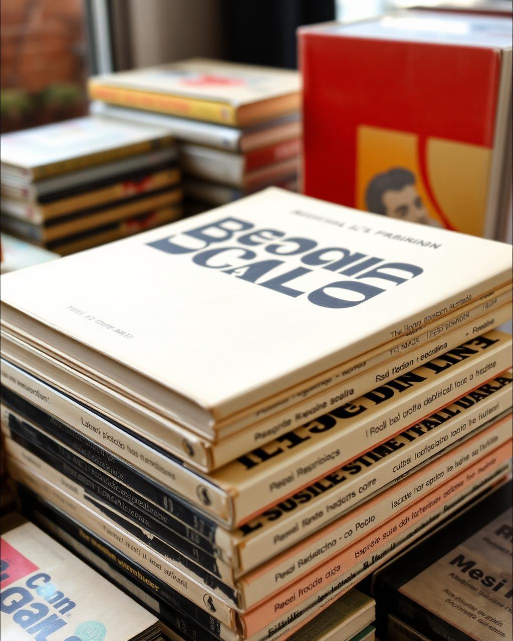
The typography of 1970s Italian book covers
I found this at a flea market in Rome. The thing that stopped me was the way the designer used white space and a single serif font across eight books.
Jess — Porta Portese, Rome12 May
03 — Paper, ink, instruments
Typography, binding, writing tools, and everything better held in hand.
#StationeryI found this at a flea market in Rome. The thing that stopped me was the way the designer used white space and a single serif font across eight books.