The typography of 1970s Italian book covers
Jess — Porta Portese, Rome — 12 May
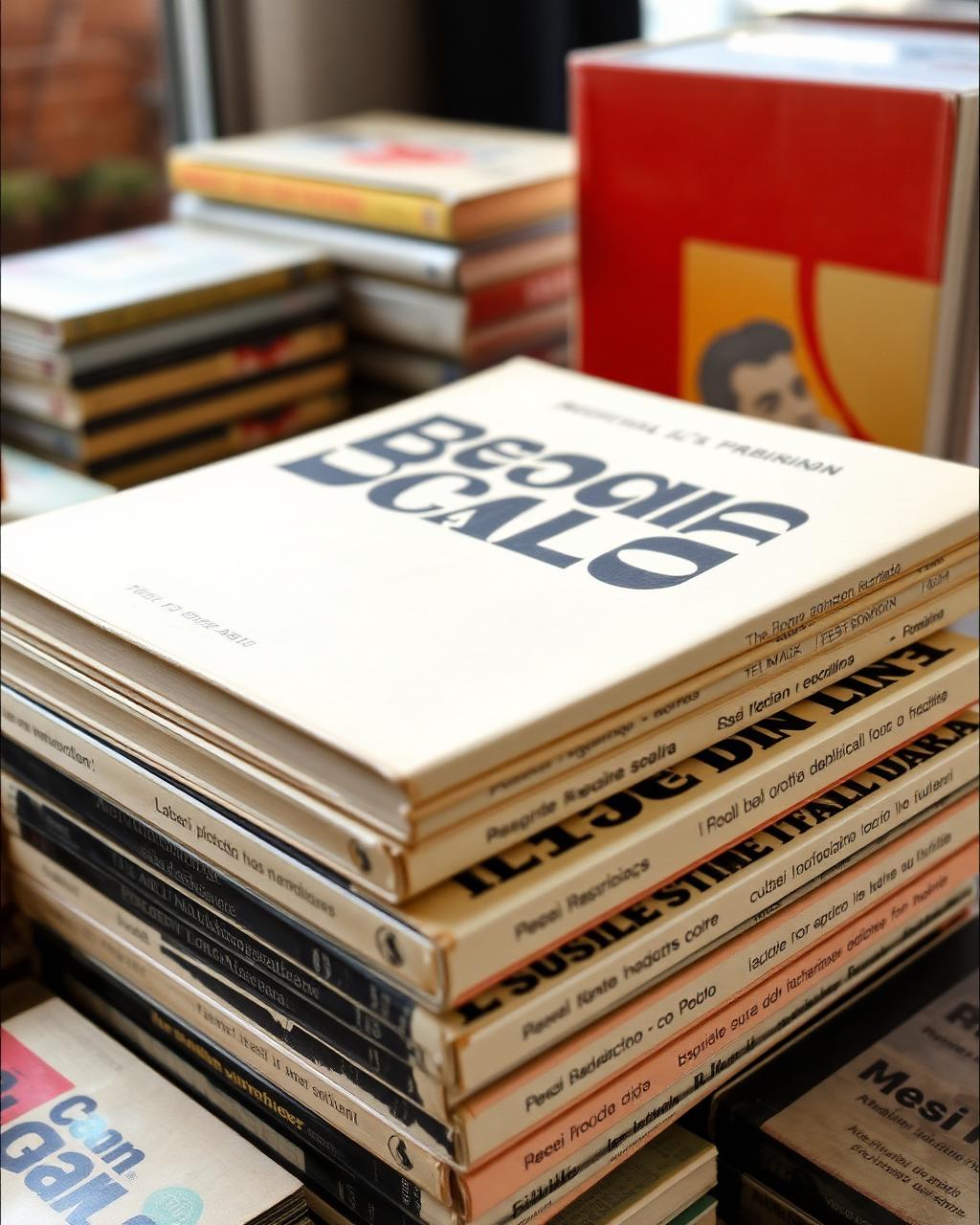
I found this at a flea market in Rome. The thing that stopped me was the way the designer used white space and a single serif font across eight books.
It's not trying to be clever. It's just… intentional. Made me think about how much modern design is noise versus restraint — and how restraint reads as confidence forty years later, when the noise has aged into embarrassment.
Discussion
Add to the thread