 #Stationery
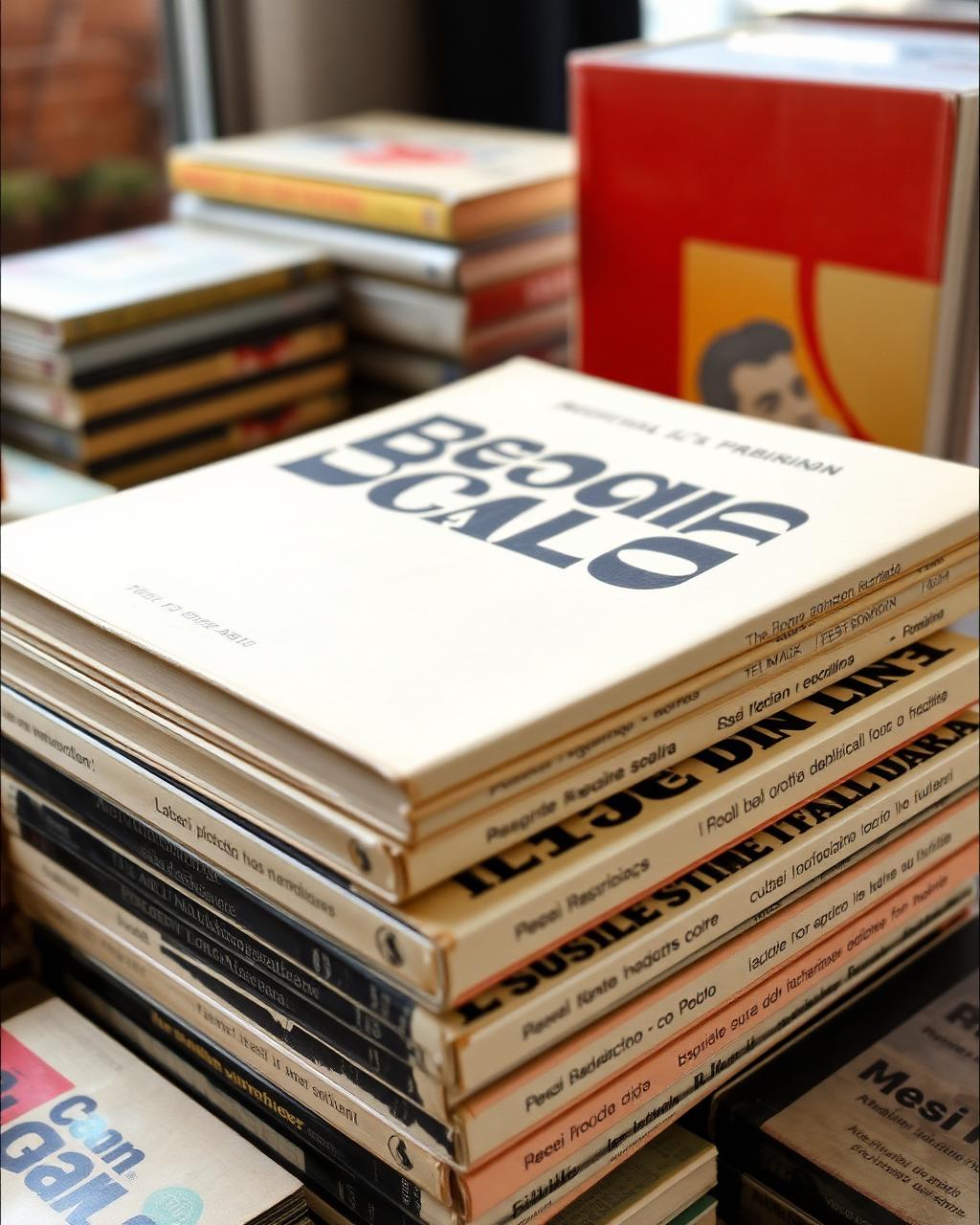
The typography of 1970s Italian book covers
I found this at a flea market in Rome. The thing that stopped me was the way the designer used white space and a single serif font across eight books.
Jess — Porta Portese, Rome12 May
A record of what caught their eye.
“Taste is noticing on purpose. It's the discipline of asking why a thing stopped you.”
stationery·thrift·misc·Porta Portese, Rome·Grand Bazaar, Istanbul·Downtown Chicago
#StationeryI found this at a flea market in Rome. The thing that stopped me was the way the designer used white space and a single serif font across eight books.
 #Thrift
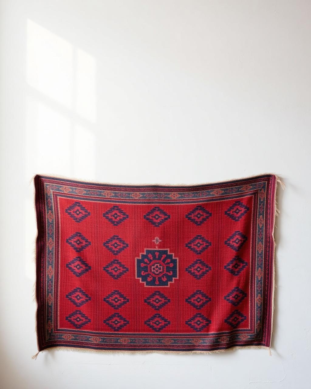
The pattern tells a story — each knot was deliberate. Somebody made this to last.
 #Misc
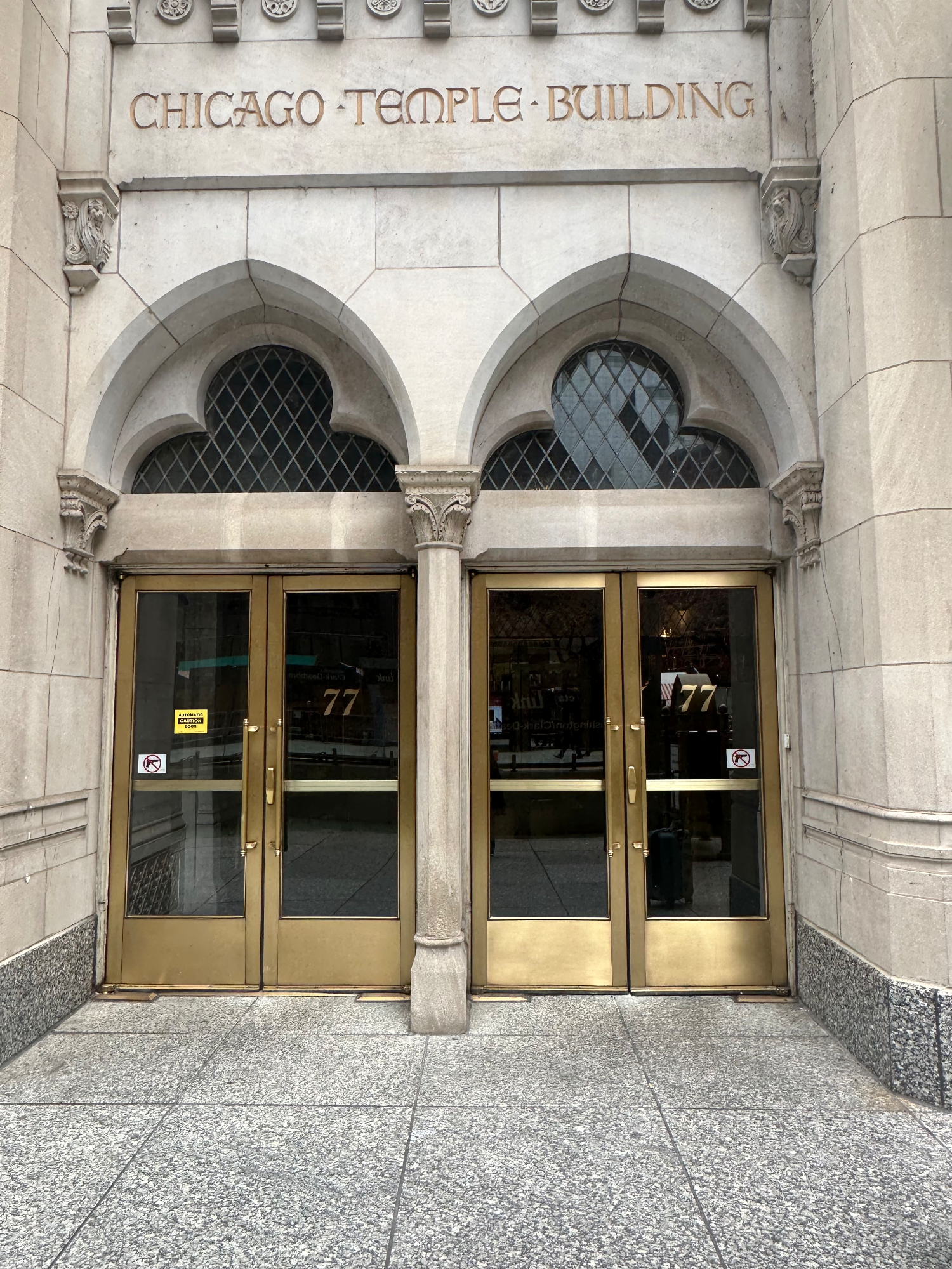
#MiscI was walking through downtown Chicago, hustling my way back to the train for the day, when I came across this set of doors. It had been a tough week and seeing this number repeated in such a gorgeous gilded font on these architecturally stunning doors absolutely stopped me in my tracks. For those not yet in the know, 77 is an angel number signifying spiritual development and breakthrough.